Introduction: Design Moments, Not Mazes
People don’t open apps for features; they come to get something done and get back to life. The near-future of mobile UX is about shaving steps and putting the right UI in the right place at the right time—sometimes not even inside your app. Think: a lock-screen card that shows progress and a single confirm button, an intent sheet that understands plain language, and layouts that stretch naturally when a device unfolds. The north star is simple: shorter paths, clearer choices, faster wins.
Apps That Understand Intent (On-Device)
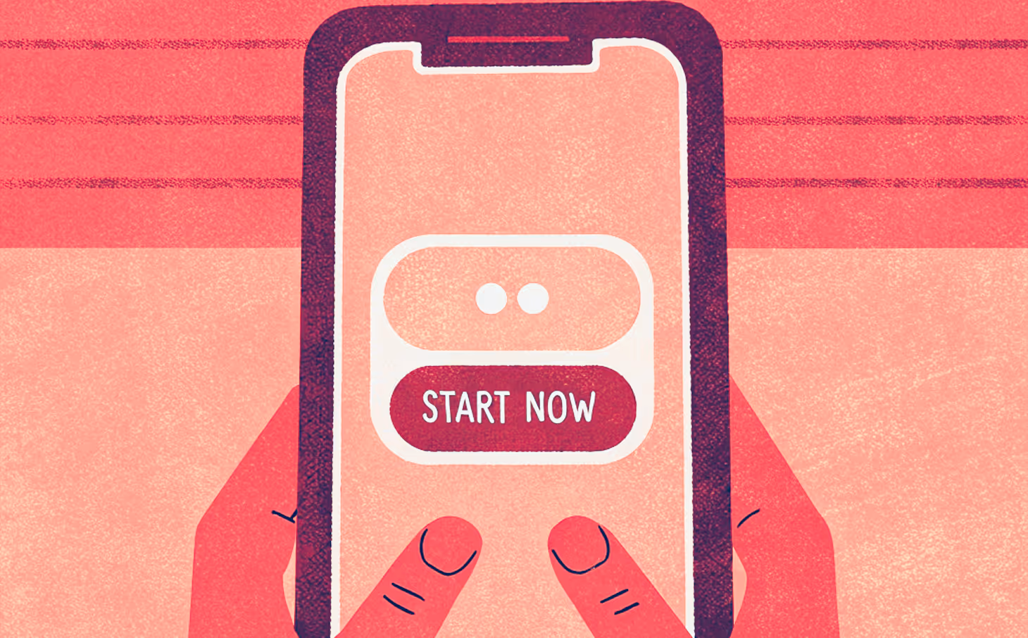
Both iOS and Android now ship intelligence at the OS level. Apple Intelligence blends small on-device models with a privacy-preserving “Private Cloud Compute” for heavier requests. Android exposes Gemini Nano through AICore to keep inference fast and local. In practice, this means your app can parse “Split the last bill with Ana and add 15% tip,” show one tidy confirmation sheet, and finish. That’s not a novelty feature—that’s the new baseline.
Do More Without Opening the App (Live Surfaces + Adaptive Layouts)

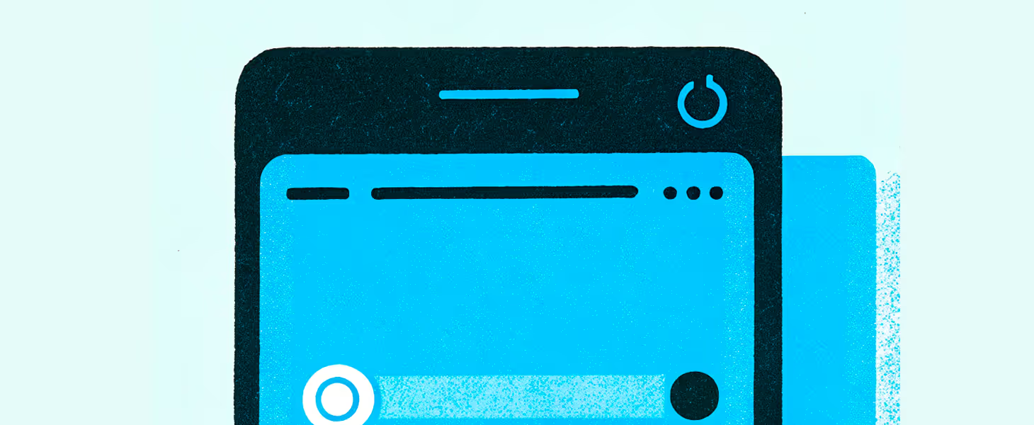
Glanceable, real-time UI is moving to where attention already is: the lock screen and home screen. iOS Live Activities and Widgets stream status; Android’s Jetpack Glance lets you build modern, Compose-powered widgets. At the same time, foldables and tablets are pushing us toward adaptive, multi-pane layouts that feel natural as screens expand. Design the state once (e.g., “pizza on the way, ETA 8:12”), render it in app and on surfaces, and let people act in a tap or two.
Make It Feel Fast & Smooth
Users don’t separate “design” from “performance.” If a tap gets instant feedback, motion explains what changed, and a tiny haptic confirms success, the experience feels trustworthy—whether or not a network call took 300ms. Platform guidance makes this concrete: Material’s motion principles and Android’s haptic design docs outline what feedback should mean and how it should feel; Android Vitals gives you the scoreboard for cold-start time, jank, and crashes. A practical budget: tap → visual feedback in ≤100ms; skeleton → real content in ~600ms
Trust by Default: Passkeys and Inclusive Basics
Passwords are finally giving way to passkeys, which use public-key cryptography tied to the user’s device (often unlocked with Face/Touch ID). They’re faster and phishing-resistant, and the ecosystem has matured enough to make them your default sign-in. In parallel, treat accessibility as performance, not polish: WCAG 2.2 adds concrete requirements, and long-standing ergonomics research still points to ~1 cm targets for comfortable tapping.
A Lighter Doorway (Fast Entry, Then Upgrade)
On iOS, App Clips remain a crisp way to let people do one useful thing fast—pay, unlock, reorder—and only install the full app when it truly helps. On Android, Google Play Instant is officially on the way out in December 2025, but the pattern still matters: give people value first, then invite the upgrade.
If you do just one thing this quarter, pick a single high-value user intent and make it travel—lock screen, widget, foldable posture, and in-app—with the same live state, the same language, and sub-second feedback. That’s what the next wave of mobile UX feels like.