Smoo Fresh Energy Smoothie Co.
Visual Identity
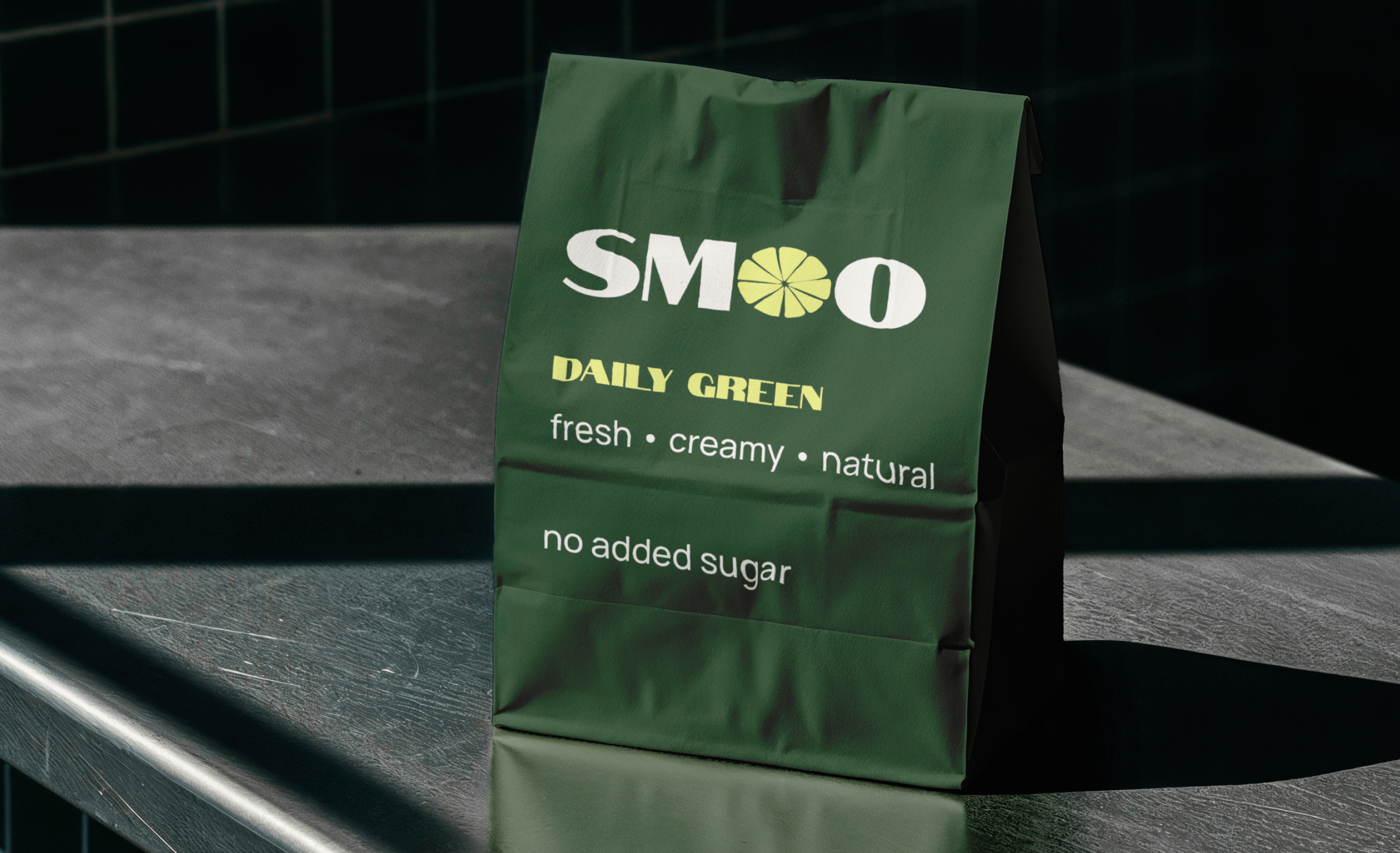
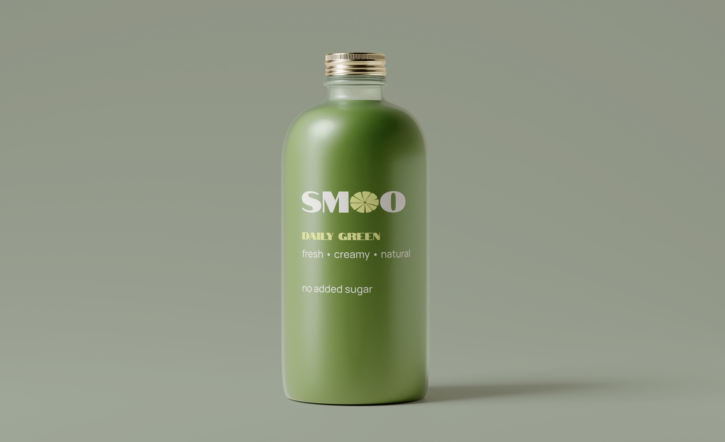
Packaging
Brand & Strategy
Problem
Smoo needed a brand identity that could stand out on a shelf full of look-alike health drinks while still feeling approachable and fun. Without a distinct visual language, the brand risked blending into a saturated smoothie and juice bar market and failing to build any real recognition or loyalty with customers.
Goal
The goal was to build a fresh, energetic identity that captures the feeling of a quick, healthy boost without falling into the generic "clean eating" visual cliché. The brand needed to feel playful and youthful, but still premium enough to justify a loyal, repeat customer base.

Final Outcome
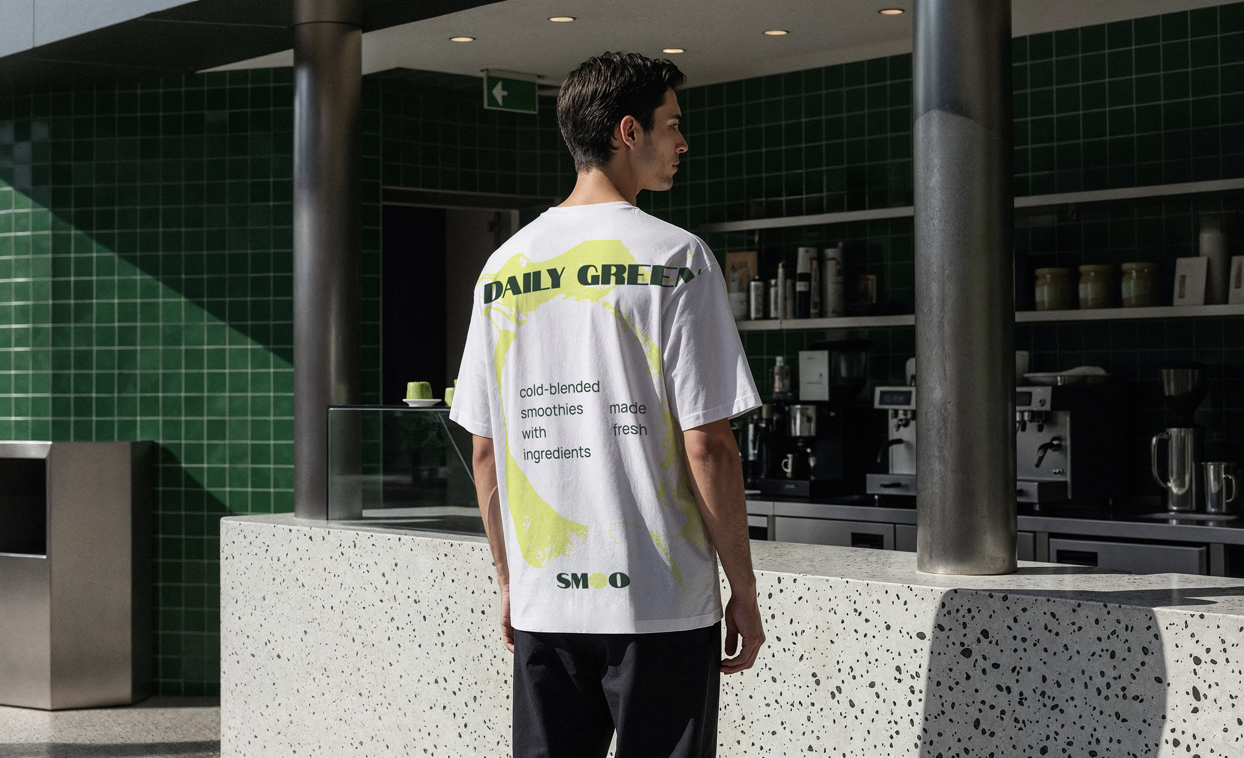
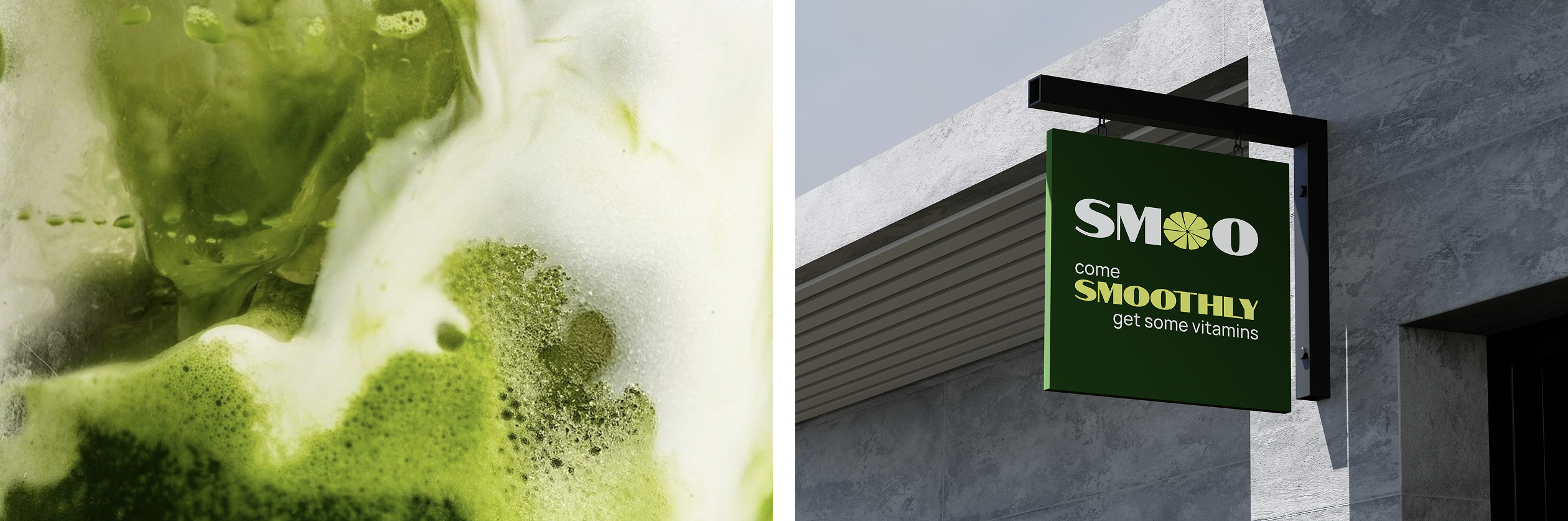
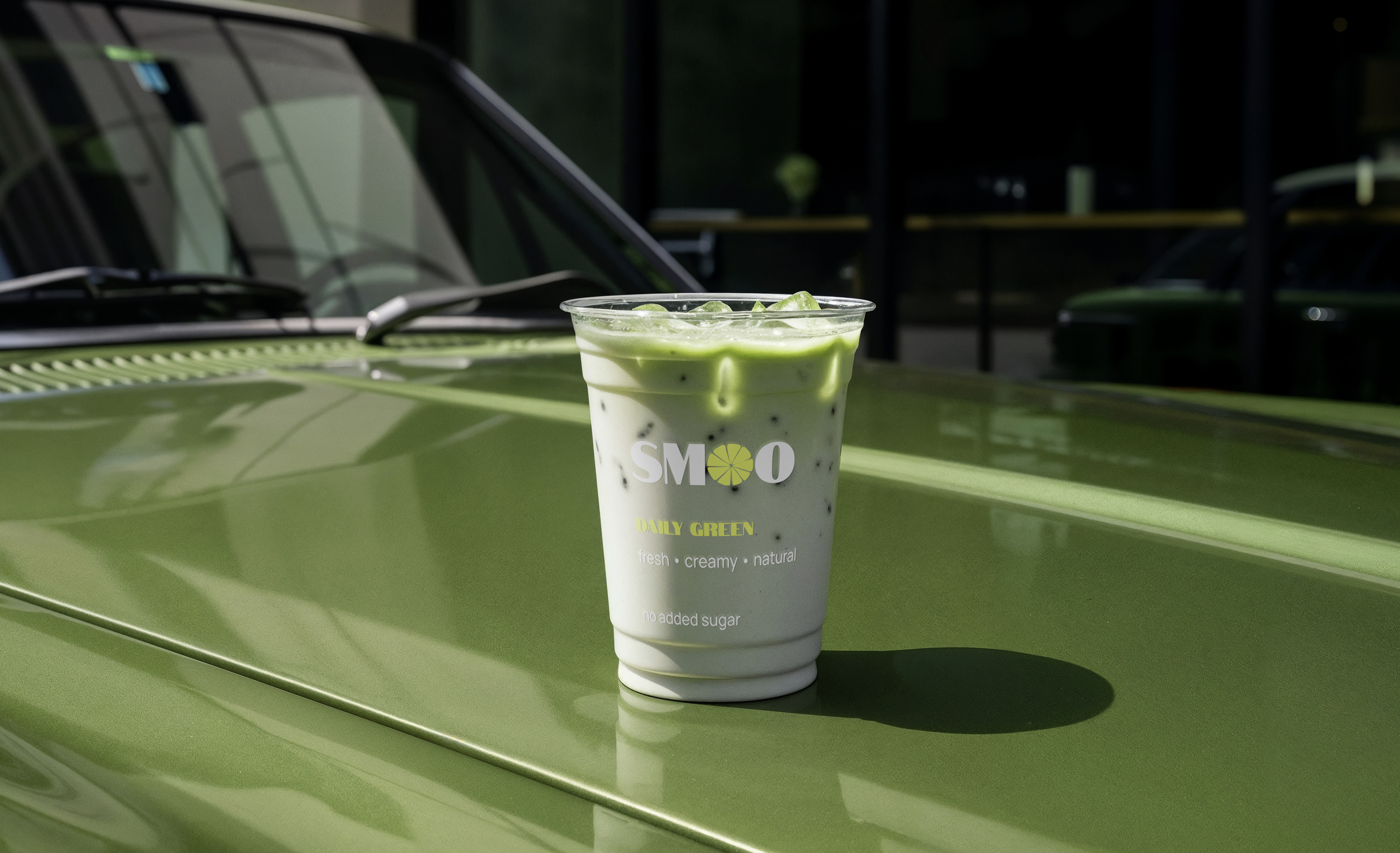
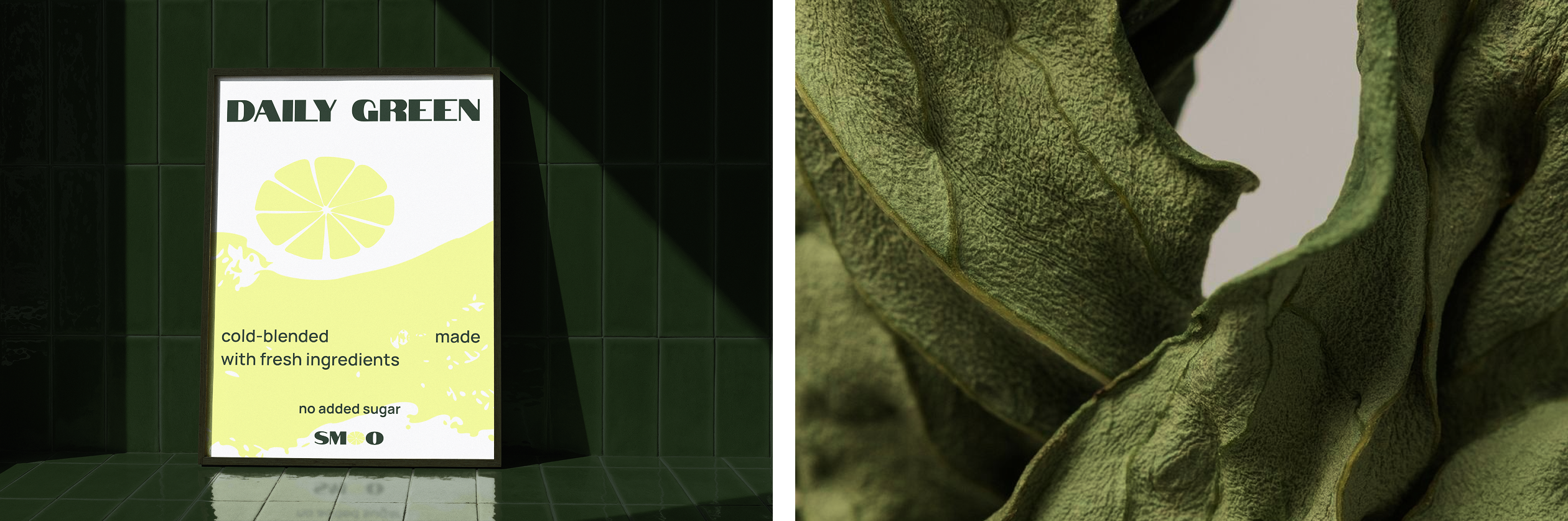
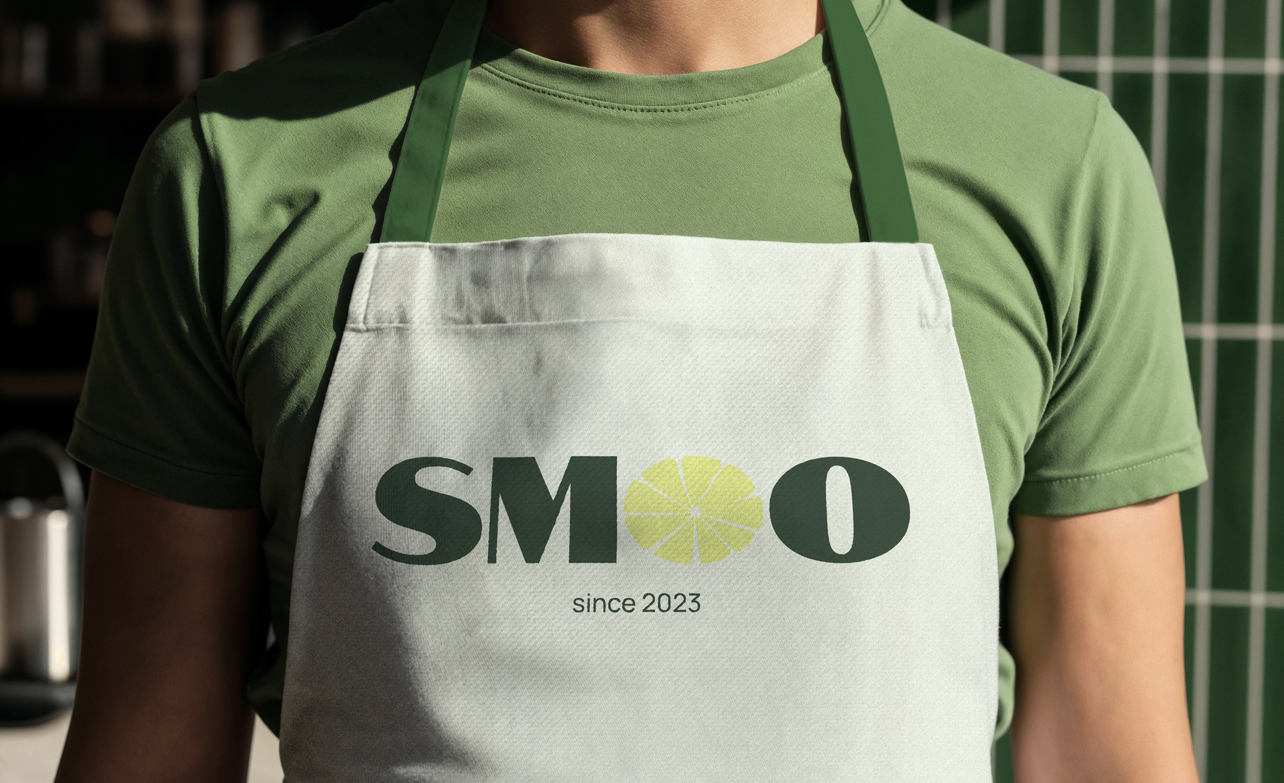
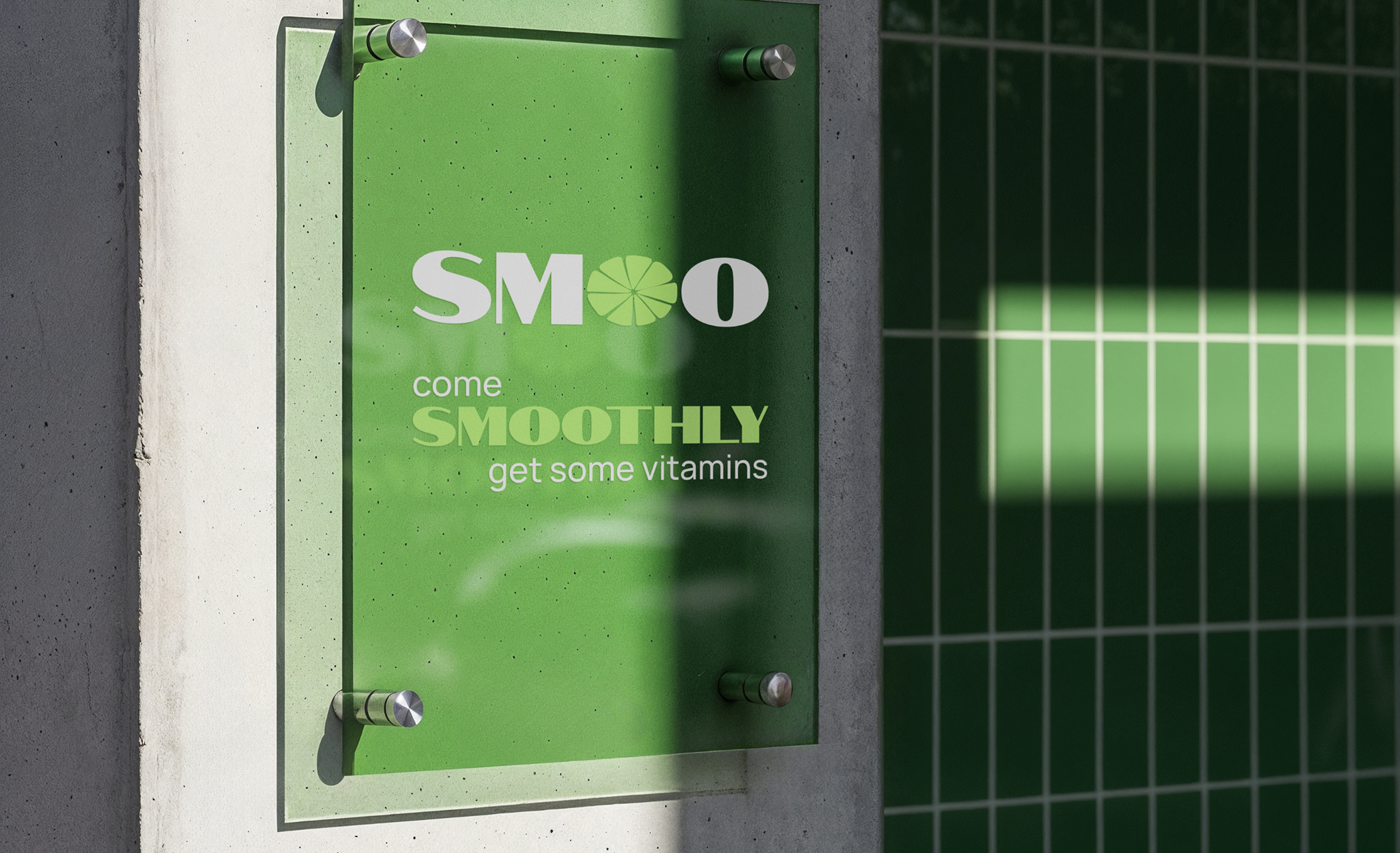
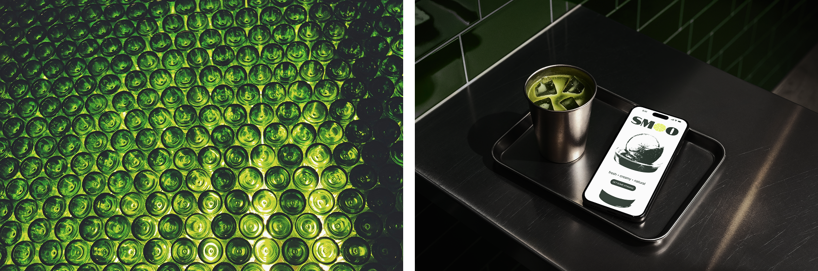
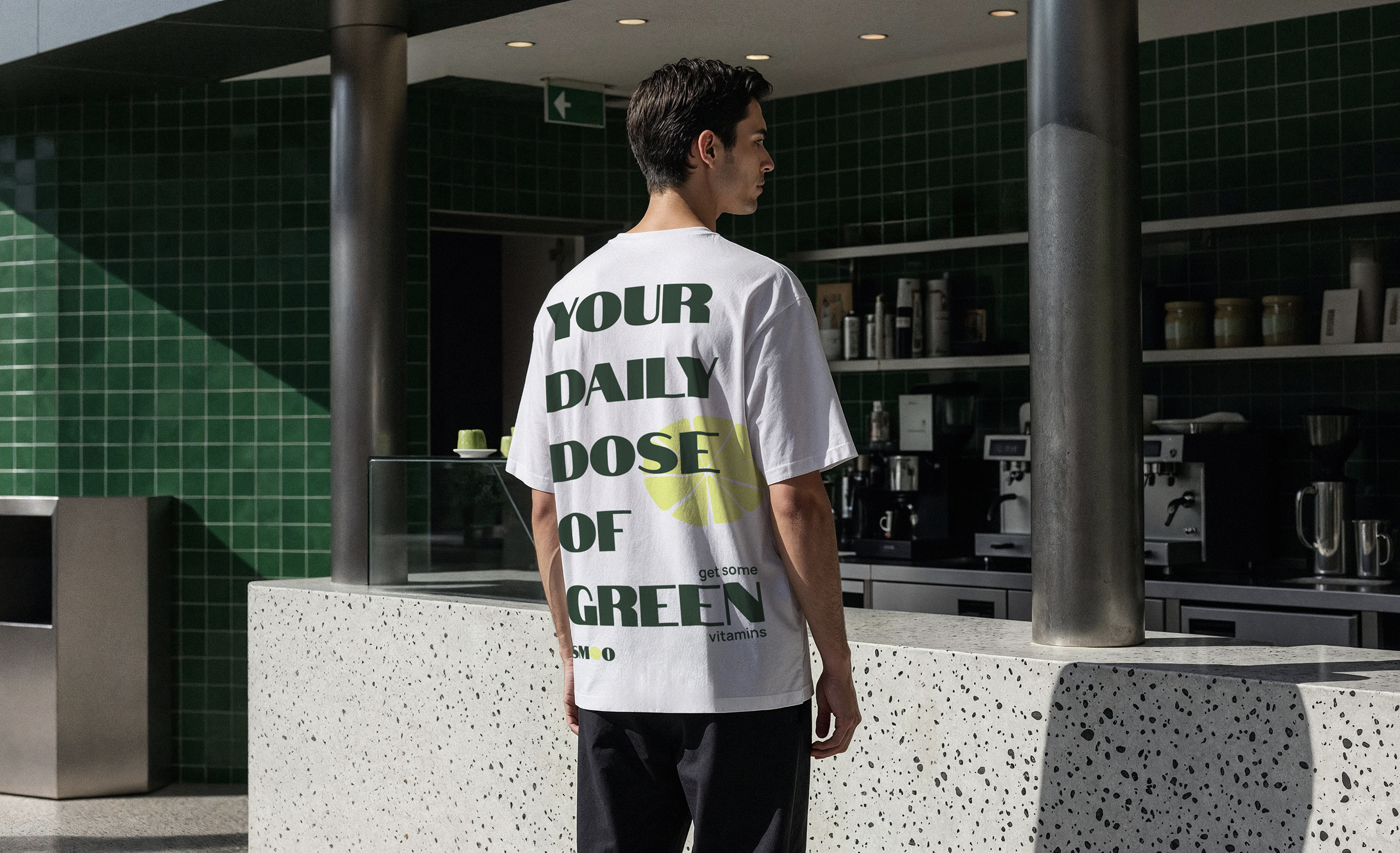
Smoo walked away with a complete brand identity system, including logo, color palette, typography, and packaging design that brings personality to every cup. The new identity gives Smoo a distinct, recognizable presence that feels vibrant on the shelf and consistent across every customer touchpoint.