W8rk, A Better Way to Find and Hire
UX Research
Mobile App Design
Website Design
Problem
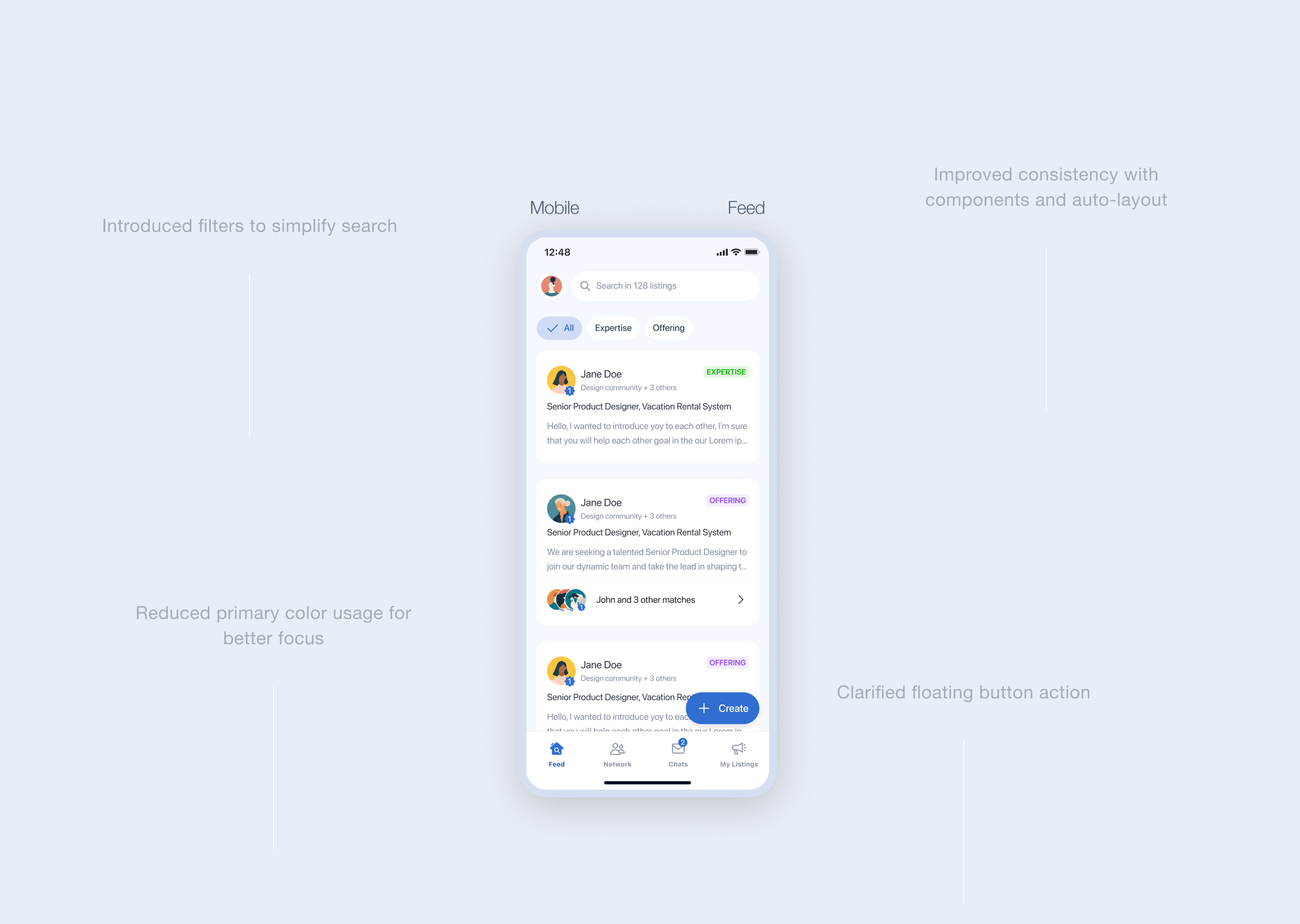
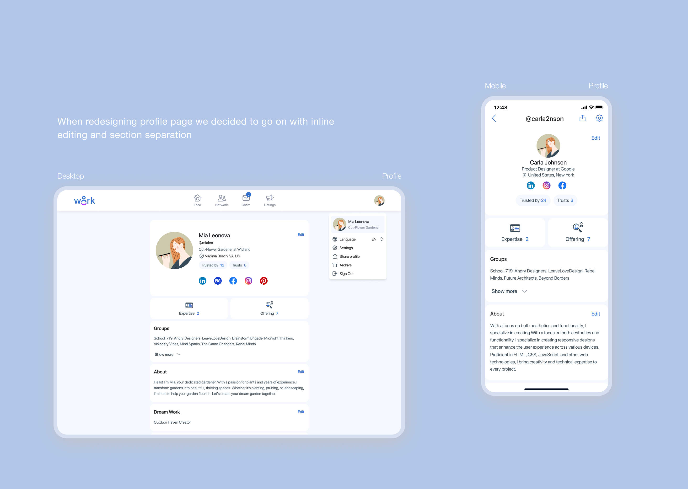
The product already had active users, but the experience was holding it back. The interface wasn’t intuitive, common actions took too many steps and felt inconvenient, and the overall UI looked dull and unengaging. There was no consistent design language, which created friction in key flows.
Goal
Make W8rk faster, simpler, and easier to use. The goal was to refresh the product visually, fix the main pain points, and create a smooth, professional experience for both job seekers and employers.

Final Outcome
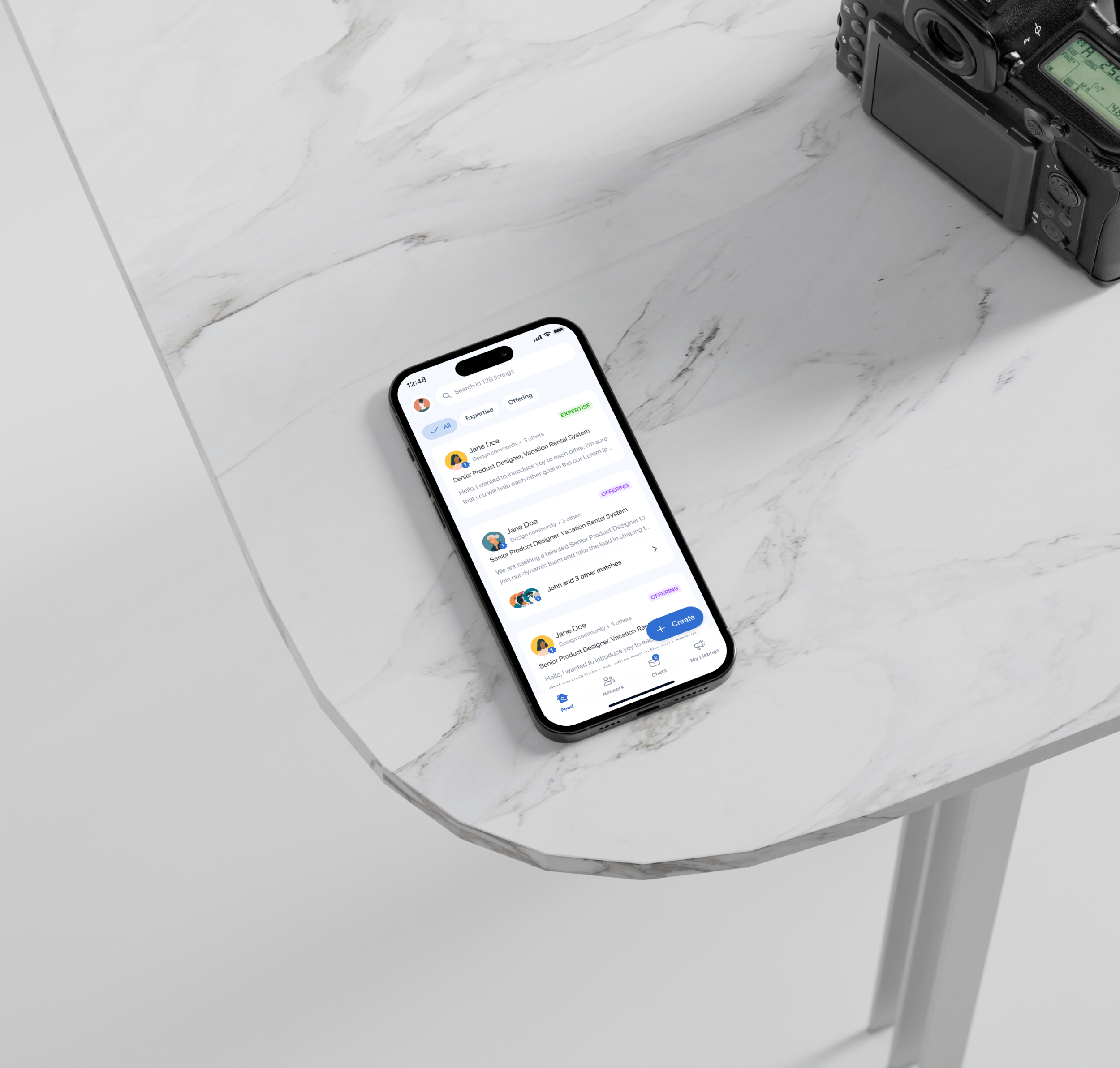
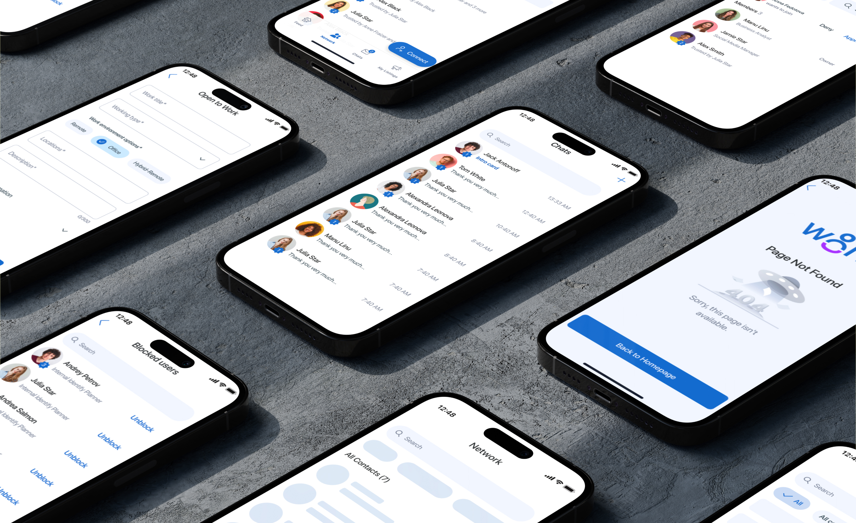
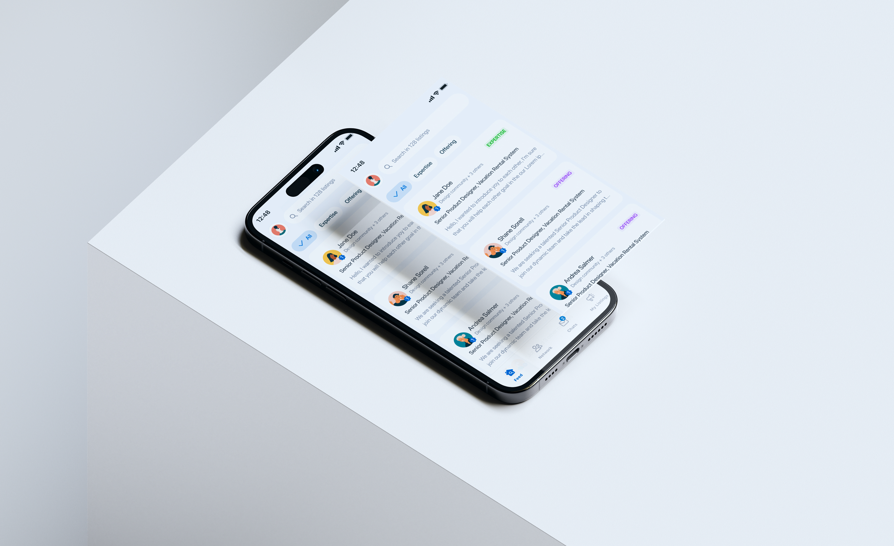
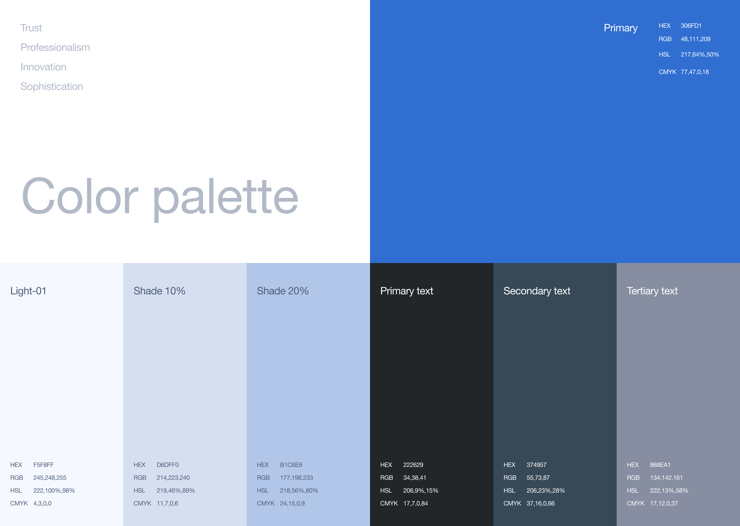
Core user journeys were simplified by removing unnecessary steps, so key actions became faster and more logical. The UX structure was clarified, the visual layer was refreshed, and a scalable design system with guidelines was added to let the product consistently go forward.