The Power of Simplicity
The best logos are often the simplest ones. Think about Nike's swoosh, Apple's apple, or McDonald's golden arches. These designs are instantly recognizable because they're clean, uncluttered, and easy to remember.
A simple logo works across all mediums from a tiny mobile screen to a massive billboard. It remains legible when printed in black and white, and it doesn't lose its impact when scaled down to favicon size. Complexity might seem impressive, but simplicity is what sticks in people's minds.
Key takeaway: If you can't sketch your logo from memory after seeing it once, it's probably too complicated.
Memorability That Lasts
A good logo doesn't just look nice it creates a lasting impression. Memorable logos have a unique quality that makes them stand out in a crowded marketplace. They often incorporate clever design elements or subtle meanings that resonate with viewers.
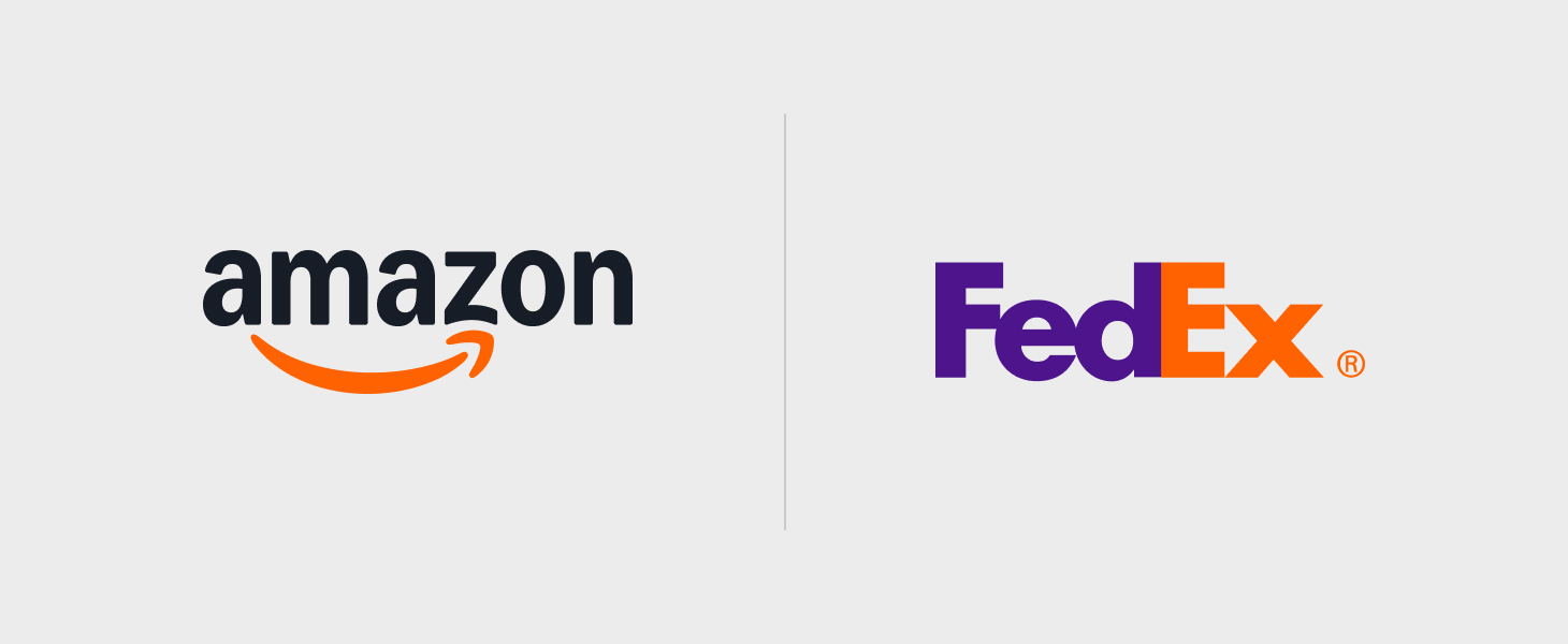
Think about the FedEx logo with its hidden arrow between the E and X, symbolizing speed and precision. Or Amazon's smile that goes from A to Z, suggesting they sell everything. These thoughtful touches make logos more than just visual marks, they become conversation starters.
The most memorable logos strike a balance between being distinctive and relevant to the brand they represent.
Timelessness Over Trends
Trends come and go, but great logos endure. While it's tempting to follow the latest design fads, whether it's gradient effects, specific typography styles, or trendy color palettes, truly effective logos transcend temporary trends.
Consider Coca-Cola's script logo, which has remained largely unchanged since 1887, or the Shell logo, which has evolved subtly over decades while maintaining its core identity. These logos prove that timeless design principles trump fleeting trends.
A logo should represent your brand for years, even decades. Design with longevity in mind, and you'll save yourself from costly rebrands every few years.
Versatility Across Platforms
In today's multi-platform world, your logo needs to work everywhere on business cards, websites, social media profiles, merchandise, and signage. A versatile logo maintains its integrity whether it's displayed in full color, grayscale, or as a single-color version.
It should look equally strong in a square format (for social media avatars), horizontal layout (for website headers), and vertical orientation (for mobile apps). Consider how your logo will appear on different backgrounds, both light and dark.
Professional designers create multiple variations of a logo to ensure it adapts beautifully to any context while maintaining brand consistency.
Relevance to Your Brand
Your logo should tell your brand's story at a glance. The colors, shapes, and typography you choose should align with your brand personality and resonate with your target audience.
A children's toy company might use playful fonts and bright colors, while a law firm would likely opt for classic typography and sophisticated color schemes. Your logo should communicate what you do and who you serve without requiring explanation.
However, relevance doesn't mean being literal. You don't need a tooth in your dental practice logo or a hammer for your construction company. Sometimes the most powerful logos are abstract marks that gain meaning through consistent brand building.
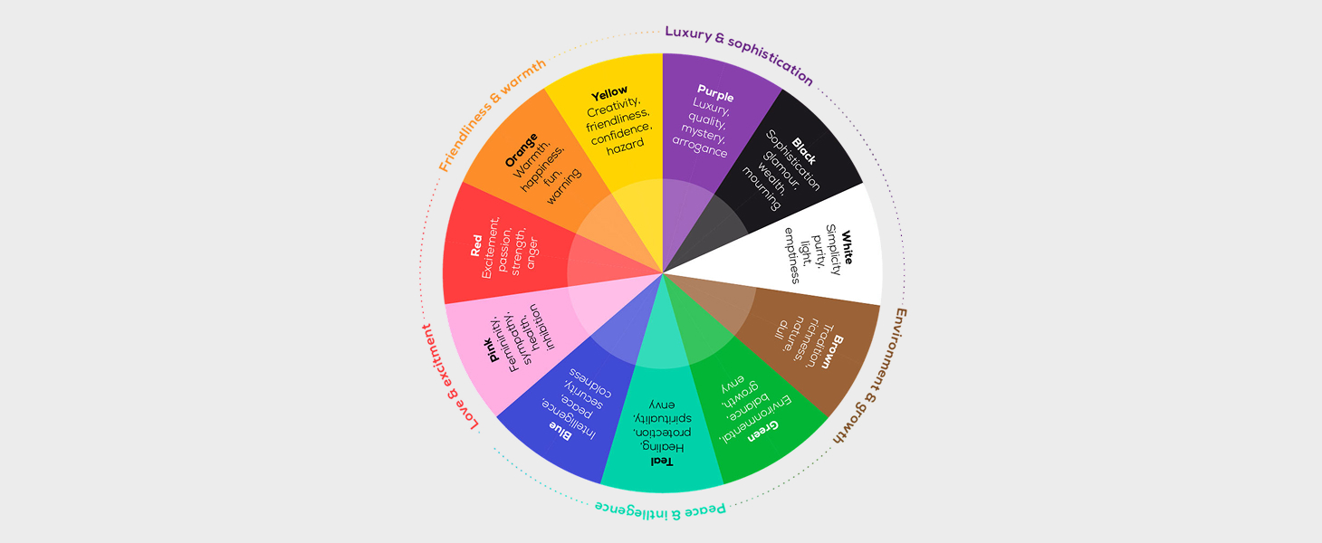
The Right Colors Make the Difference
Color psychology plays a crucial role in logo effectiveness. Different colors evoke different emotions and associations. Blue conveys trust and professionalism (think IBM, Facebook). Red signals energy and passion (Coca-Cola, YouTube). Green represents growth and health (Whole Foods, Starbucks).
Beyond psychology, your color choices should ensure good contrast and readability. A logo that's hard to read defeats its purpose. Additionally, consider how your logo looks in monochrome, this is crucial for certain applications and printing scenarios.
Great logos typically use a limited color palette (two to three colors maximum) to maintain clarity and reduce printing costs.
Unique and Distinctive
In a sea of competitors, your logo needs to stand out. It should be distinctive enough that it won't be confused with other brands in your industry. This requires thorough research during the design process to ensure your logo doesn't accidentally resemble existing marks.
Uniqueness doesn't mean being weird for the sake of it, it means finding your own visual voice. The goal is to create something that's unmistakably yours, something that captures your brand's essence in a way no other logo does.
A truly distinctive logo becomes a valuable asset that contributes to brand equity over time.
Conclusion: Investing in Excellence
A good logo is an investment in your brand's future. It's worth taking the time and allocating the budget to get it right. Whether you're working with a professional design agency or refining your vision, remember that your logo will represent you in countless interactions with customers, partners, and the world.
The logos that stand the test of time share these common traits: they're simple, memorable, timeless, versatile, relevant, colorful with purpose, and distinctively yours. Master these principles, and you'll create more than just a logo, you'll create a visual identity that drives recognition, builds trust, and grows with your brand for years to come.
Ready to create a logo that checks all these boxes? Let's make something remarkable together.


.png)